A young couple's new home
What was the task?
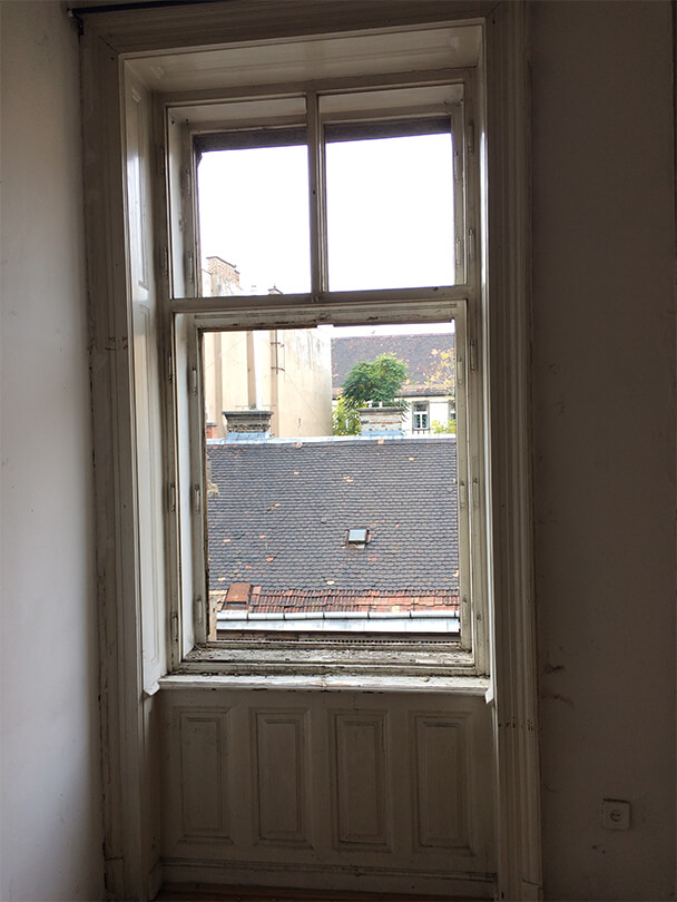
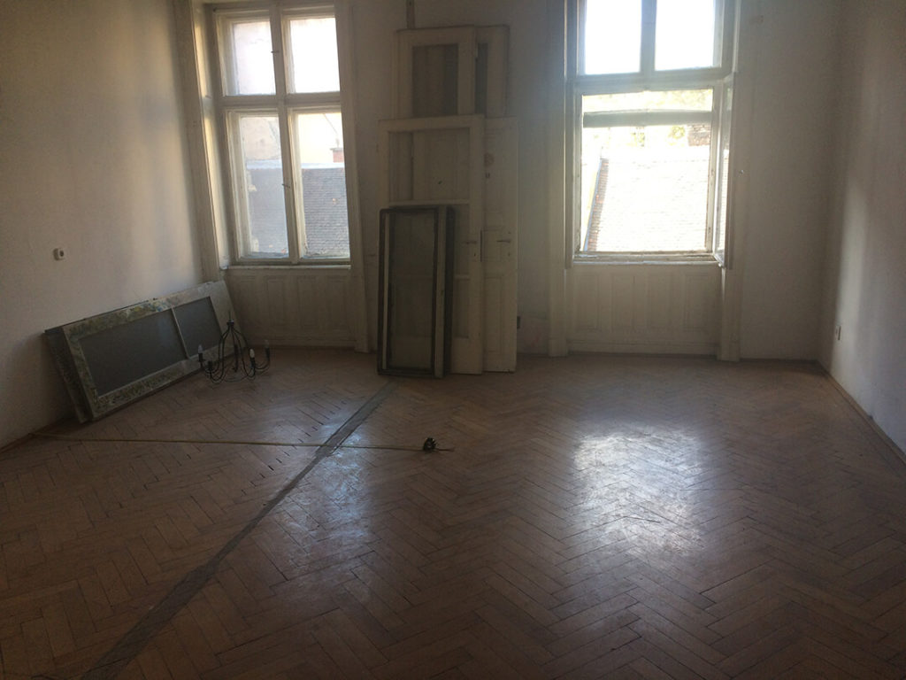
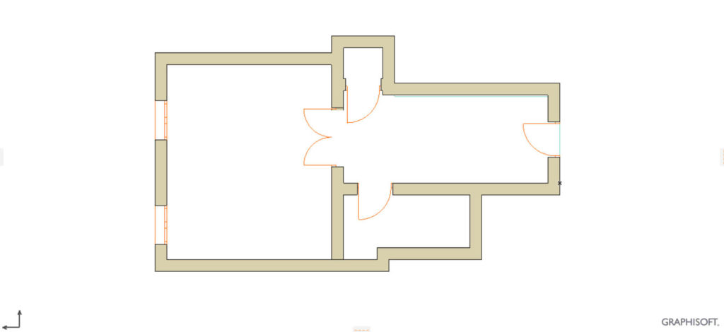
The task was to create a new home for a young couple by rethinking the design of a forty-seven-square-foot apartment with high ceiling, mostly in poor condition. Seeing the old, extremely worn-out interior, it seemed that the needs of the new owners could only be met with very complex solutions as the original design of the apartment was fundamentally at odds with today’s expectations. The outer walls formed a relatively irregular shape, due to which the wall niches in two rooms made it difficult to utilize the available space. Moreover, in addition to the corridor, the small utility room and the bathroom, there was only one room at our disposal; although it was of quite a large size. All of this had to be turned into a home with a pleasant and well-usable kitchen, an adjoining dining area, a cosy bathroom, a separate bedroom as well as a living room with a work unit; all in an arrangement that evokes a practical and homely atmosphere. Another important aspect was to have enough space for storage furniture since the apartment was intended to be used as a permanent residence, not only occasionally.
Challenges
The young couple insisted on preserving the original three-meter ceiling height, so dividing the interior horizontally was out of the question. However, we still had the option of some – vertical – redesign of the rooms, which was achieved by building plasterboard partitions. This phase of the renovation required the most thorough planning as well as the most creative – yet clean – ideas, as such a restructuring of the space determines the basic character of the apartment, which can no longer be modified much in the later phases of the work. We had to pay attention to the two large windows located on the outside of the room, which are the natural light source: had we restricted the path of the light flowing in here too much, we could have made the whole apartment dark, thus making it impossible to create a homely atmosphere. Of course, when designing the smaller rooms, we also had to ensure easy and reasonable access within the apartment.
Let’s see how this task, which may seem impossible at first, was successfully solved.
The beginnings
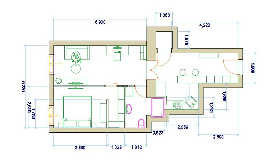
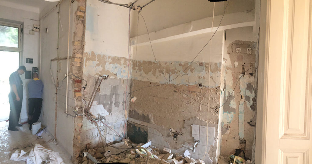
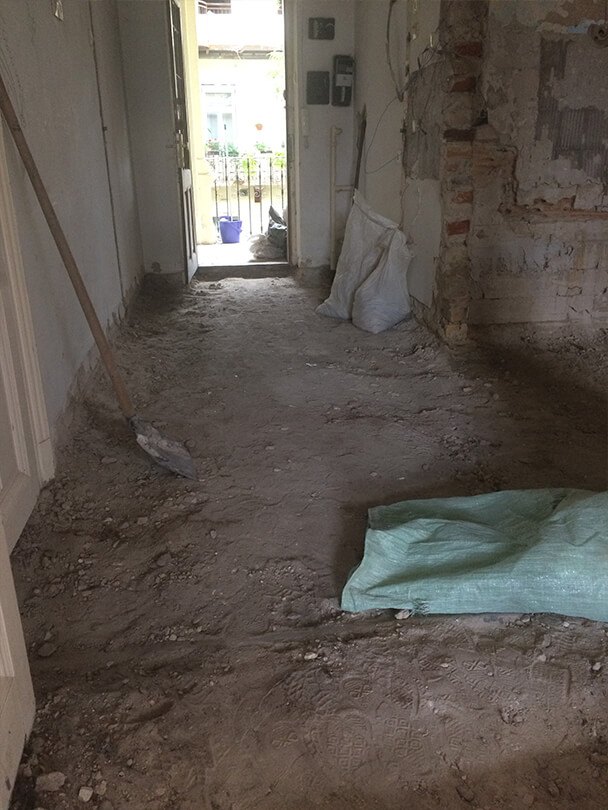
The nearly six-meter-long entrance hall was connected to the old bathroom, on the site of which the new kitchen was designed. The space thus unified eliminated the former tightness of the hall and thus a pleasant dining counter bordering the kitchen could be created. In addition, this room – quite precisely the corridor – also provided space for the necessary extra storage space, which increased the total volume of storage furniture in the apartment to a level that exceeded expectations. The utility room, which opens from the entrance hall/kitchen –without area modification –, was retained, providing a perfect, hidden space for the water heater and tumble dryer.
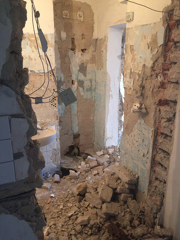
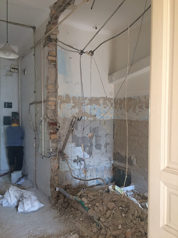
Further improvements
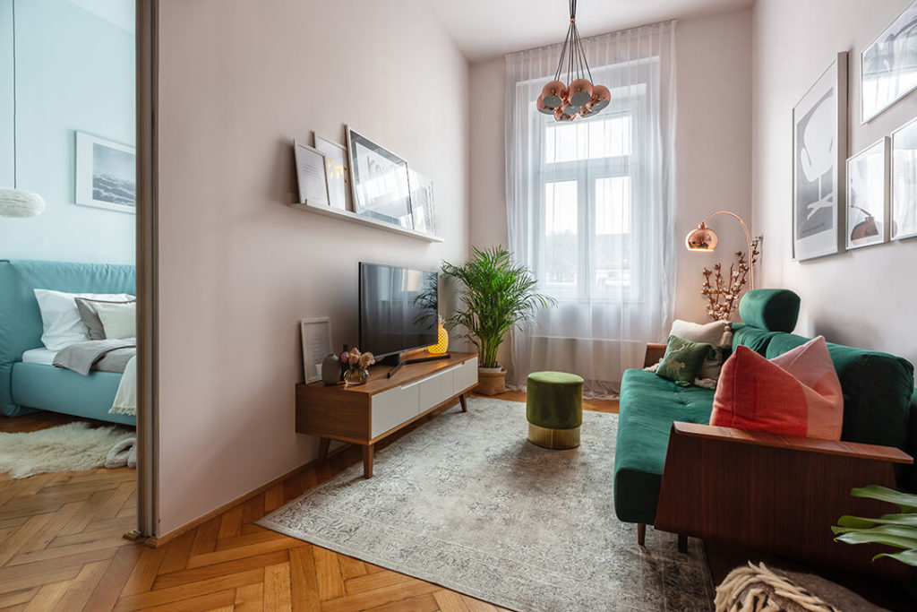
All additional functions had to be implemented in the large room area. To this end, we divided the previously uniform, large space into four smaller units. One half of the room – in the form of an elongated rectangle – remained undivided to preserve the feeling of spaciousness in the study/living room to be designed here. The work unit mentioned above was going to be located here, as well as the sofa that can be converted into a guest bed, which makes the apartment suitable for accommodating guests. In the other half of the former large room, in the unit next to the window – which is relatively larger –, we designed a small room that can accommodate a double bed, a set of bedside tables and bedroom furniture. This is the bedroom, which is ideal for a quiet retreat inside the apartment. From here you can enter the closet created by the partitions, whose storage capacity also brought unexpected results, and whose entrance opens from the living room – you can actually get to both the bedroom and the closet through this entrance. In this doorway, a sliding door was used to help reduce the load on the living space. The fourth detached unit is the bathroom with a shower and toilet. The shower cabin somewhat enters the area of the former bathroom, which is now the kitchen. However, it occupies the part of the kitchen furniture that is practically the least usable – the corner part to be exact. Thus, we minimized the damage caused by the inevitable loss of space – the abovementioned shower cabin is, of course, bordered by a partition wall, the above description refers to the floor plan location.
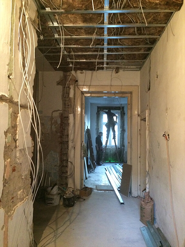
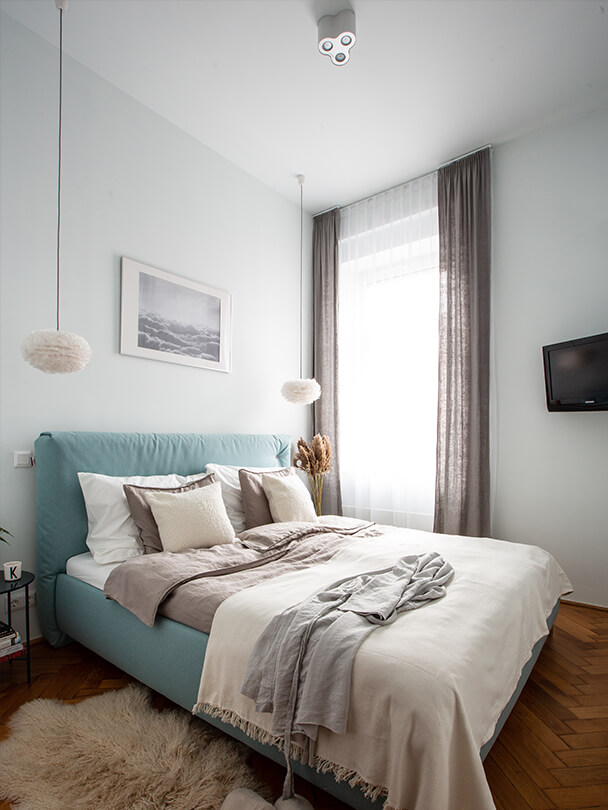
This is how we created the necessary rooms. However, the task was not over yet. What we needed the most up to this point was clever organization, accurate calculation, and sheer sense of space, which is, of course, extremely important for laying the groundwork. However, the real magic only begins here: playing with colours, shapes, visible materials. All this is a very exciting activity, but without consciousness, our momentary rapture can destroy the desired unity as well as the harmony of the apartment. These technicalities are paramount in the final stages of the design of the living space.
In the spirit of this, we chose bright colours that harmonize with each other for both the walls and furniture. The owners insisted on preserving the original wood flooring in the old large room – which we managed to put in great condition with some care –, so we adjusted to that as well. The floor covering of the rest of the apartment was made of white synthetic resin. The white floor creates an excellent harmony with the light walls, together they enhance the feeling of spaciousness. However, excessive use of white colour can create a bleak atmosphere or even cold brightness, thus, in order to avoid this unpleasant effect, we glued green, leafy wallpaper to the wall surfaces of the entrance hall and the kitchen. The green colour as well as the natural shapes radiate cheerfulness: with this clever detail, we have added a lot to the cosiness of the apartment.
The final result
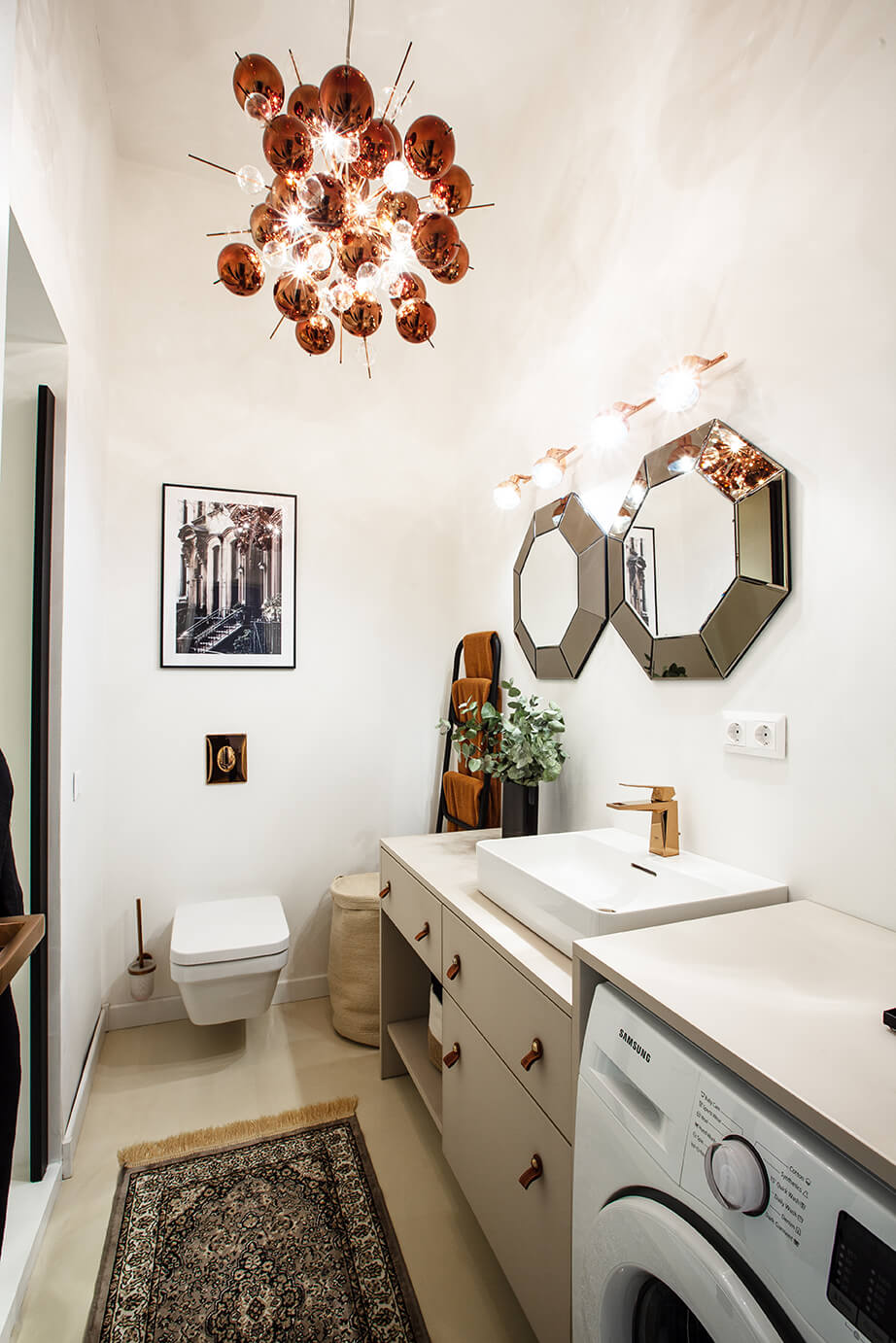
After achieving these remarkable results, perhaps it may seem as if the interior designer’s business was coming to an end at this point. However, there is another secret to creating a particularly lovable home: beyond the perfect overall picture and inner harmony, you need something unique, something special that will make the apartment personal and memorable. In this case, the bathroom design became the extraordinary feature. The customer’s expectation was to make the room look and feel more like a living space, so instead of ceramic tiles, we covered the floor with white synthetic resin, placed pictures on the walls, and installed a huge chandelier for lighting. The overall effect became captivating.
In the end, in addition to the joyful satisfaction of the young client couple, this renovation taught us that even the seemingly poor condition of the apartment, its small floor area and imperfect division together couldn’t constitute an obstacle that could stand in the way of creative and conscious design as well as skilful and precise implementation. If you are aware of your needs and assess your abilities correctly, then you may be able to create the interior that can become a real home for you.
